 Thanks: 0
 Likes: 0
 Dislikes: 0
-
Super Member

Re: New logo...thoughts?
 Originally Posted by JMP

IMO.....reminds me of dbl D's and twin peaks found on the female of the species....again...just me....
Some other like-minded individuals: 
Originally Posted by FUNX725
Originally Posted by Perfect_Image
Bob thanks that logo looks great might use a version of that, and who doesn't like dd's? I should be very popular.
Bob
"Be wary of the man who urges an action in which he himself incurs no risk."
~Joaquin de Setanti
-
Super Member

Re: New logo...thoughts?
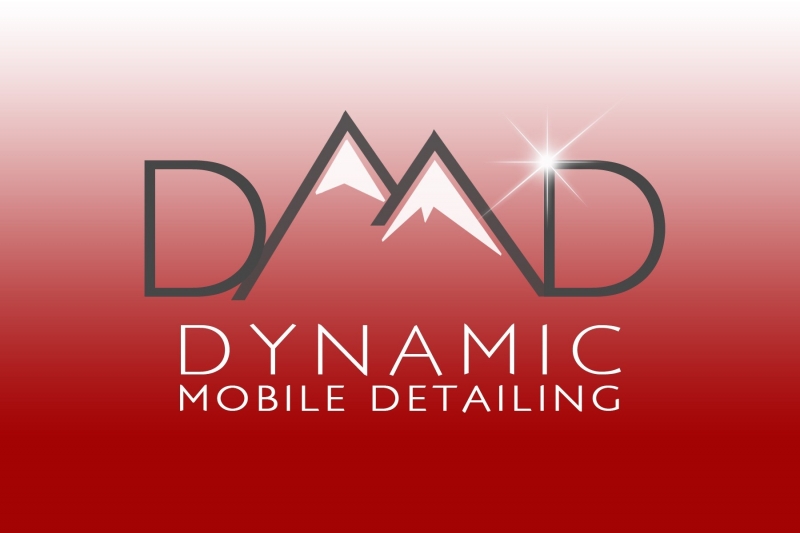
Thanks for checking it out guys, I really appreciate the thoughts and advice. I'm really looking for a clean and simple look with both the logo and my whole new website. It sounds like on the logo front, I'm heading in the right direction.
Originally Posted by Loser
I like it, looks clean. My only feedback is to shorten up the left slope of the right mountain a bit more to make more of an 'M'. At first it looked like 'DAAD' to me.
This is great advice, thanks so much! I felt like something was a little off with the M but couldn't pinpoint it. This should help a lot.
Originally Posted by FUNX725
^^Looks good!  ^^
I'll drink to that... 

Bob
Funny that you mentioned Coors, cause Bend, OR (the new city I'll be in) is HUGE on beer (a very nice little side-benefit) and has recently been rated as having the most craft breweries per capita (80,000 people at 19 breweries! I won't complain)
I'm working with my graphic designer (my sister) and should hopefully have a new copy of the logo sometime tomorrow. Thanks again guys, and any other tips that anyone else might have are more than welcome.
-
Super Member

Re: New logo...thoughts?
I would remove the D's on the sides of the mountains. It looks a little funny, and I'm not sure if it's the font or the mountains are over powering them or both.
Really great start. I think it's a unique logo and design for detailing.
-
Super Member
Re: New logo...thoughts?
Originally Posted by Scott@IncrediblyDetailed
I would remove the D's on the sides of the mountains. It looks a little funny, and I'm not sure if it's the font or the mountains are over powering them or both.
Really great start. I think it's a unique logo and design for detailing.
Thanks Scott, however the logo is the initials, which is also my new - much shorter - domain, so I feel like it's probably pretty important to keep them, thanks though!
-
Super Member

Re: New logo...thoughts?
I like the look.
But if I may interject a wonderful website that I found and have actually used.
It's called Logo Design by LogoTournament
For $275 bucks you get logo designs from not one person, but 30 or 40+
They come from all around the world and you can tell them that you want mountains in it. You want it to say "DMD" etc. it's very versatile.
I know you said you were working with your sister but it's always nice to get multiple ideas because after all your logo really is your first impression for professionalism.
-Chris
Chris (a.k.a. Pockets)
Warehouse Manager
Pockets@poorboysworld.com
(845)215-9700

-
Super Member

2022 Jeep Gladiator Rubicon 2021 Ford Ranger Lariat 2016 Alfa Romeo 4C Spider 2006 Buell Lightning-Bolt 2004 Jeep Wrangler Rubicon
-
Re: New logo...thoughts?
Trim the middle leg....sounds painful
Great looking logo
I would decrease the length of the descending stroke on the letter M, to increase read ability. Currently, it looks like DAD at 1st glance
-
Super Member
Re: New logo...thoughts? UPDATED!
Thanks again for all the thoughts at tips. I changed the colors a bit since I'll have it on the side of my red car, so didn't want competing colors. I'm feeling good about this one, but can't decide if I should include the line between the logo and business name or not, I keep going back and forth. what do you guys think?

Or
Thanks again everyone!
-
Super Member
Re: New logo...thoughts? UPDATED!
Originally Posted by jarred767
Thanks again for all the thoughts at tips. I changed the colors a bit since I'll have it on the side of my red car, so didn't want competing colors. I'm feeling good about this one, but can't decide if I should include the line between the logo and business name or not, I keep going back and forth. what do you guys think?
Or
Thanks again everyone!
I like the line
2022 Jeep Gladiator Rubicon 2021 Ford Ranger Lariat 2016 Alfa Romeo 4C Spider 2006 Buell Lightning-Bolt 2004 Jeep Wrangler Rubicon
-
Re: New logo...thoughts?
I really like the logo, I think it looks better without the line. I also like the addition of the reflection spot and the spacing/sizing of the name is much better than just straight block text.
Similar Threads
-
By fav605 in forum How to make money detailing cars
Replies: 8
Last Post: 05-12-2016, 09:36 AM
-
By Lustrous Detail in forum Introduce Yourself
Replies: 0
Last Post: 05-02-2015, 07:13 PM
-
By Gsrjake in forum How to make money detailing cars
Replies: 19
Last Post: 10-21-2013, 11:27 PM
-
By Evan.J in forum How to make money detailing cars
Replies: 49
Last Post: 08-10-2013, 01:34 PM
-
By Black N' Yellow in forum How to make money detailing cars
Replies: 21
Last Post: 12-30-2012, 10:28 PM
 Members who have read this thread: 0
There are no members to list at the moment.
Posting Permissions
- You may not post new threads
- You may not post replies
- You may not post attachments
- You may not edit your posts
-
Forum Rules
|
| S |
M |
T |
W |
T |
F |
S |
| 31 |
1
|
2
|
3
|
4
|
5
|
6
|
|
7
|
8
|
9
|
10
|
11
|
12
|
13
|
|
14
|
15
|
16
|
17
|
18
|
19
|
20
|
|
21
|
22
|
23
|
24
|
25
|
26
|
27
|
|
28
|
29
|
30
| 1 | 2 | 3 | 4 |
|


 Reply With Quote

Bookmarks