 Thanks: 0
 Dislikes: 0
-
Super Member

Re: Share your best business card design tip?
One important tip that I profess in all Business documents including web sites is SPELLING, SPELLING, SPELLING. Make sure everything is spelled correctly.
Ed
-
Re: Share your best business card design tip?
craz0boy, WOW, there is A LOT going on with those cards. Type seems really small and the tagline is so much like mens warehouse you might get some chuckles.
I have a background in design and have spent quite a bit of time on my own cards. I am not a professional detailer but my speciality is photography. My cards are photography based and there was design after design that when into them.
I don't mean to pick apart peoples work I am just giving an opinion. I have made quite a few of these mistakes along the way.
Sorry if I have offended
Tom
-
Super Member

 Originally Posted by richy

That's a great idea! How do you get one of those made up?
There are sites you use to make them for free. I had a link tha the person PMed me but I can't find it now. Google it and you can find it. I have an app on my iPhone that can make them also.
-
Super Member

Re: Share your best business card design tip?
Originally Posted by musicman66
I had a friend of mine design a logo for me and used a few pictures of cars that I've taken on the backs. They just got sent out today and I can't wait to see them. :-)
Very sharp card!
Originally Posted by RChicago
APAD - While I LOVE the front of the card, I think there are too many things on the back. Makes the type very small and hard to read. This is just my two cents. The front is killer!!! Love the logo! I look at that and instantly see polished auto detailing.
I think the back might be better just saying, AUTO, BOAT and MOTORCYCLE Detailing.
The facebook logo is larger than your website text which indicates to me your more proud of your facebook than your website.
Make the card drive (pun intended) people to your website where you can tell people what you do. ie. the waterspot removal, and polishing etc. Make the website text stand out more than your facebook.
Again my two cents.
Thank you for your feedback!
In my neck of the woods, people don't know much about paint correction. I wanted the card to be educational about what i do. to you and I who understand about compounding and polishing and refining paint, the logo on the front says it all. Yes it may be more wording, but i want people to know that i am more than just a wash and wax service.
now as far as the font size, i agree with you! it is harder to read than i would like, maybe on my next batch i will have "Paint Correction Services - Visit our website to learn more!" or something along those lines. that would free up at least 1 line enabling me to have a larger font on the wording.
the logo on the back on the bumper is just to incorporate the logo into the back of the card. i want the FB to stand out so people go and "like" the page. from either source, the site or the FB page, they can easily navigate to the other, so i dont mind which one they go to, as long as they call me.
thanks for taking time to critic!
-
Super Member

Originally Posted by RChicago
craz0boy, WOW, there is A LOT going on with those cards. Type seems really small and the tagline is so much like mens warehouse you might get some chuckles.
I have a background in design and have spent quite a bit of time on my own cards. I am not a professional detailer but my speciality is photography. My cards are photography based and there was design after design that when into them.
I don't mean to pick apart peoples work I am just giving an opinion. I have made quite a few of these mistakes along the way.
Sorry if I have offended
Tom
None taken my friend. The punch line was done purposely to get those chuckles lol but I did get the feeling that it was a tad overcrowded. Thanks for your input, this is far from my finished product. You should have seen my cards before this. haha I needed an update bad.
-
Regular Member

Re: Share your best business card design tip?
Originally Posted by UltimateDetail
Never use the vistaprint or staples pre made designs.
Why not? They actually had a great design that was eye catching. The general public isn't going to know where it came from. Plus, like I said, it looks pretty good. Everyone seems to like it. And I like how you can take the general design and have hats, t-shirts, signs, address labels made on the cheap. Vistaprint is hard to beat for the cost conscious.
Perhaps one day I will make my own design and have them printed on high quality plastic, but for now it's fine. WAY better than doing it at home on an inkjet printer.
Vistaprint used to be cheap quality and limited designs, but they've upped their game and now give you many choices of pre-made designs and use good quality paper. Plus, 500 cards for $5 is unbeatable.
-
Super Member
I agree ^. I use vista print as well basically unbeatable prices and they can make anything from biz cards to t-shirts to coffee mugs. Also have the options to upload you own custom designs. Recently received 500 front and back biz cards for $20, free t-shirt, 50 free custom color front & back high gloss brochures, 25 free biz magnetic cards, 10 gift cards, free car magnetic sign, free biz card holder. Total came out to about $40 including shipping.
-
Re: Share your best business card design tip?
Originally Posted by richy
I think it's cool to use a car you detailed.
I agree. Actually, if a person is going to use a car on their business car I think it's important and cool to use a car they have actually detailed.
It can be a point of conversation and it can showcase your talents plus it shows you can walk the talk.
If you use a car you snag off the Internet somewhere there's no discussion and worse, if the customer asks if you actually detailed the car on your card you'll have to say "no" and that doesn't help a person's cause.

-
Re: Share your best business card design tip?
This has turned out to be a very good thread that I'm confident will help a lot of people into the future...
Keep the tips coming guys...

-
Re: Share your best business card design tip?
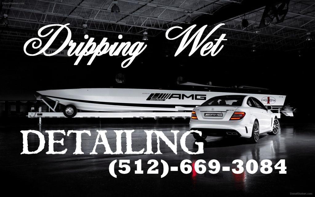
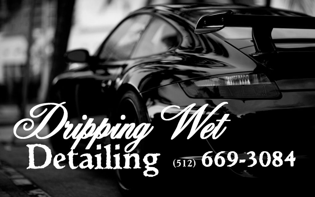
These are the front of two of mine. They look betterin person because these pictures are not cut.
Similar Threads
-
By Kyle@PrecisionPolish in forum How to make money detailing cars
Replies: 0
Last Post: 06-18-2013, 06:54 PM
-
By jgibson2980 in forum How to make money detailing cars
Replies: 6
Last Post: 04-25-2013, 01:48 PM
-
By Alek@DeepClean in forum How to make money detailing cars
Replies: 20
Last Post: 03-03-2013, 04:08 PM
-
By KJW Detailing in forum How to make money detailing cars
Replies: 5
Last Post: 10-29-2012, 08:37 PM
-
By Plan b Detail in forum How to make money detailing cars
Replies: 21
Last Post: 08-06-2011, 02:40 PM
 Members who have read this thread: 0
There are no members to list at the moment.
Posting Permissions
- You may not post new threads
- You may not post replies
- You may not post attachments
- You may not edit your posts
-
Forum Rules
|
| S |
M |
T |
W |
T |
F |
S |
| 31 |
1
|
2
|
3
|
4
|
5
|
6
|
|
7
|
8
|
9
|
10
|
11
|
12
|
13
|
|
14
|
15
|
16
|
17
|
18
|
19
|
20
|
|
21
|
22
|
23
|
24
|
25
|
26
|
27
|
|
28
|
29
|
30
| 1 | 2 | 3 | 4 |
|


 Likes:


 Reply With Quote
Bookmarks