I do all my own designs. These cards are front and back. I do a lot of bikes and cars so these should appeal to everyone. I don't like cramming a bunch of info on a card.
Those that work from your house, do you put your address, or just the city, or nothing? I don't seem to mind everyone knowing what town I am in, for some reason even the street, but just don't want to put all my info on a business card.
It seems like I am missing something, but this is a card I just whipped out to see what it would look like. What do you guys think?
What I do is put my website on my card as the main idea. On the back I give some details about what I do and lead them to my website. Once they visit my website, a short video automatically plays about what a automatic car wash does to their car(best selling point for new cars and higher end cars btw) and then I go on a bit about what I do and then they call up.
So I started my business 2 years ago and threw together a cheap business card. I didn't have a website, Facebook page, or even logo for my business at that time so it is kind of out dated. I don't feel that it looks professional at all and honestly I am not even proud of it, which causes me to not distribute them as much as I should.
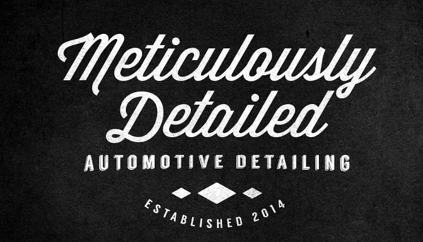
This winter I have been in the process of creating a new business card that I can be proud of and was looking for your honest feedback before I place an order. The front is nice and simple with my businesses logo and nothing else. I thought about just adding the website or phone number at the very bottom, but I don't want to clutter it up. I also want ALL the contact info in one location. The front and back has a matte finish and is only black and white for a clean simple look.
Front:
I then decided that this go around I needed to convey some information on the back of the card. Not just all my contact information and this time my website/Facebook pages, but also the services I provide. Now I realize that it looks a little busy, but I wanted to list as many services as I could to separate me from just someone washing vehicles (no offense to those that just wash vehicles....haha). I'm thinking the back needs a LITTLE color to break things up....maybe give the contact info or website fonts some color? Just unsure since my logo has no color. Any input would be appreciated!
So I started my business 2 years ago and threw together a cheap business card. I didn't have a website, Facebook page, or even logo for my business at that time so it is kind of out dated. I don't feel that it looks professional at all and honestly I am not even proud of it, which causes me to not distribute them as much as I should.
This winter I have been in the process of creating a new business card that I can be proud of and was looking for your honest feedback before I place an order. The front is nice and simple with my businesses logo and nothing else. I thought about just adding the website or phone number at the very bottom, but I don't want to clutter it up. I also want ALL the contact info in one location. The front and back has a matte finish and is only black and white for a clean simple look.
Front:
I then decided that this go around I needed to convey some information on the back of the card. Not just all my contact information and this time my website/Facebook pages, but also the services I provide. Now I realize that it looks a little busy, but I wanted to list as many services as I could to separate me from just someone washing vehicles (no offense to those that just wash vehicles....haha). I'm thinking the back needs a LITTLE color to break things up....maybe give the contact info or website fonts some color? Just unsure since my logo has no color. Any input would be appreciated!
Back:
From my experience (I handed out 2000 business cards last year) the "list of services" on the back doesn't make a lick of difference. With my new business card I decided to put social media logos on the back to push people to follow me, there isn't really any way to track this but I felt it cleaned up the card. Also I like to have a good amount of blank space on the back to write a note/quote/appointment down. The other thing I would suggest is making the back more symmetrical.. Because how the paint correction list runs into the other column and your contact info is not centered; that will bother ocd people, which should be your ideal client haha
Finishing Touch Auto (Stayton, OR)
Ryan Hendricks (Owner) 503-602-8483 FTA Website
I have been toying with business card composer for MAC and like what you can do with it. Is anyone else using it and what paper are you using to print out your cards if you are printing them out yourself?
I have been toying with business card composer for MAC and like what you can do with it. Is anyone else using it and what paper are you using to print out your cards if you are printing them out yourself?
All I can tell ya is, Avery (avery.com) has a bunch of various business card stock. Check out their web site or hit up you local Office Max or similar.


 Thanks:
  Likes:
  Dislikes:


 Reply With Quote


Bookmarks